
Well now that we are settling into the routine of 2016…..
I’ve received a request from a friend for more recipes. So here you go…. knowing we are all still trying to eat relatively healthy I found one I just love. Now I know you might be saying how can a vegetable be a warm, fuzzy, comfort food. This one is. Cauliflower gets such a bad rap. It’s actually quite versatile and because it absorbs the flavors you roast or cook it with it it chameleon “esque” in its taste. I found this one courtesy of BonAppetit but have home tested it frequently.
Ingredients
SERVINGS: 4
- 2 tablespoons olive oil, divided
- 1 large head of cauliflower
- Kosher salt, freshly ground pepper
- 2 tablespoons unsalted butter
- ¼ cup raw shelled pumpkin seeds
- ½ teaspoon crushed red pepper flakes
- ¼ cup chopped fresh cilantro, plus leaves with tender stems for serving
- 1 tablespoon fresh lime juice
Preparation
-
Preheat oven to 450°. Coat a large rimmed baking sheet with 1 Tbsp. oil. Trim cauliflower stalk and place head stalk side down on a cutting board. Slice cauliflower lengthwise into ½” slices. Arrange cauliflower slices and any stray pieces in a single layer on prepared baking sheet. Drizzle with 1 Tbsp. oil and season with salt and pepper. Roast until underside is deeply browned, 20–25 minutes. Turn cauliflower over, season with salt and pepper, and continue to roast until other side is dark brown and crisp, 15–20 minutes longer.
-
Meanwhile, melt butter in a small skillet over medium. Add pumpkin seeds, bring to a simmer, and cook, swirling pan occasionally, until pumpkin seeds are toasted and butter is browned and smells nutty, 6–8 minutes. Remove from heat and add red pepper flakes; let cool 10 minutes. Add chopped cilantro and lime juice; season with salt and pepper.
-
Arrange cauliflower on a serving platter and drizzle with dressing. Serve topped with cilantro leaves. I use arugula instead of cilantro. But you could use parsley or any herb you like.
There you go Grayson!

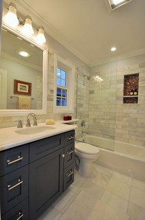
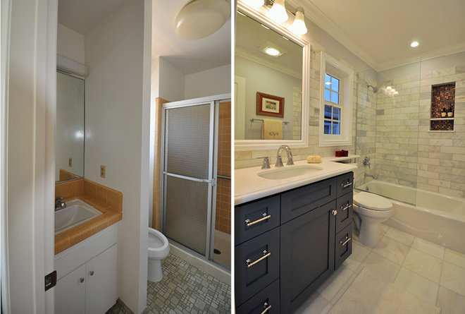
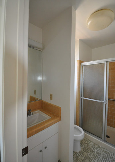
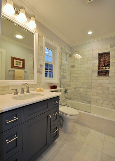

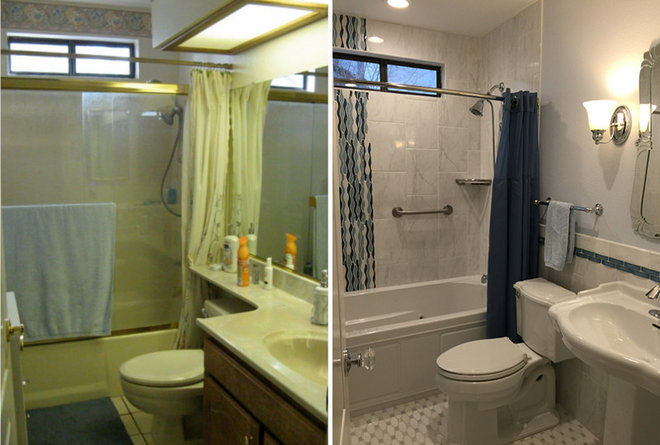
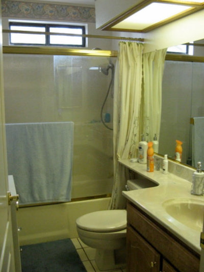
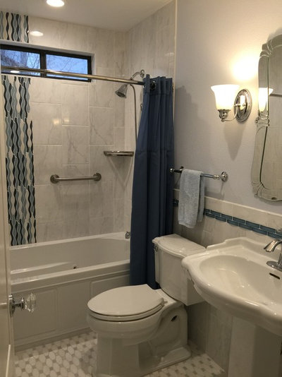
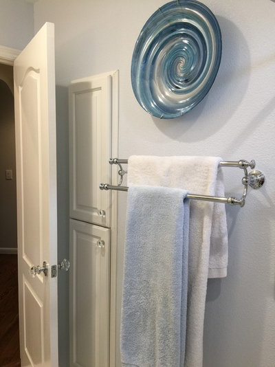














hwswthr
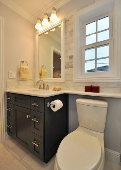
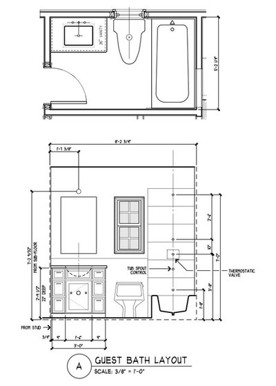
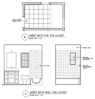
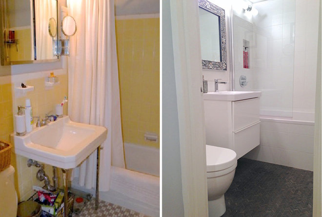
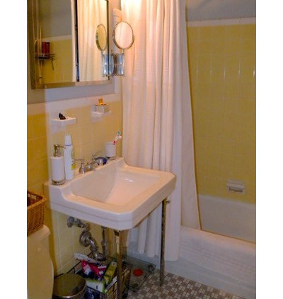
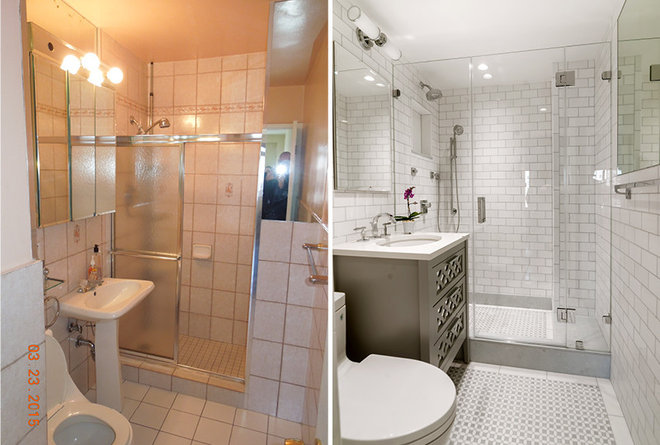
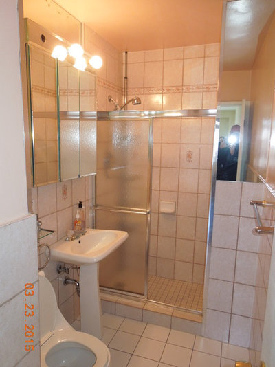
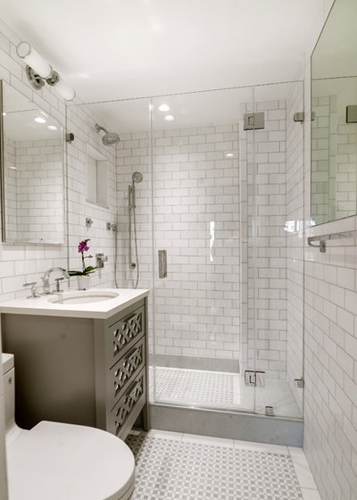
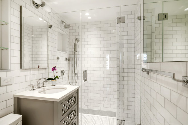
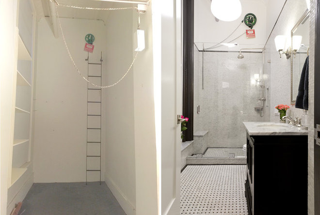
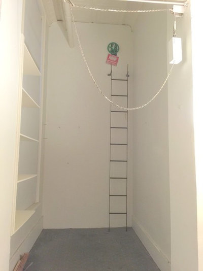
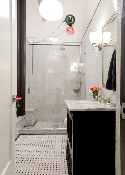
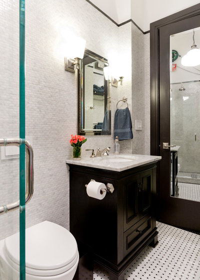
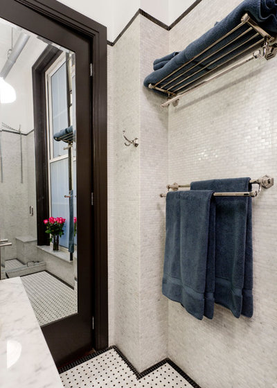
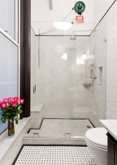
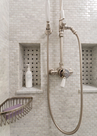
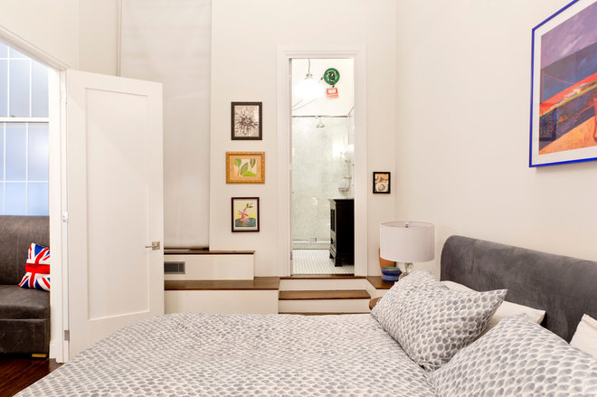
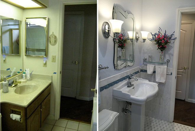
I like that you showed #1 & #5. Each took an opposite approach to toilet space and made it look better. Each home has different needs and each designer has a different eye. And in #4, I appreciate how the designer dealt with the pipes and a required fire wheel in the shower stall. It isn’t as aesthetically appealing but makes for a good story. More interesting than a bathroom in a newly built suburban hone.
mrsben
All are fantastic upgrades! Though not a designer having completed one bathroom upgrade and have three more to go so here are a few of IMHO tips: a) If you can, avoid moving the toilet as otherwise it will be costly. Also consider its ‘rough in’ (distance from the wall to the drain pipe) prior to purchasing one. Note: The width of most toilet tanks today are not as deep either so you may end up with a gap between it and the wall as in pic #5. Also be aware of elongated bowls as they may not fit into your space. b) Make a floor plan and measure not once but twice for fixed elements. i.e.: Vanity, tub, toilet, niches etc. c) To give an illusion of space, do not hesitate to use larger tiles or mirrors. Also, even the colour of grout you choose for tile can influence the illusion. d) If vanity countertop space is limited, consider adding a wall niche beside it. The same element can be applied for tub/shower stall areas. For size and/or spacing of shelves, it will depend upon your personal needs. e) Also, in lieu of double faucets, consider a single one instead as maintenance is a snap plus you will have extra room for that hairbrush … ☺. Manufactures have come a long way in styling. f) Install shelving where you can. i.e.: The areas behind a toilet tank; over or on a door is often wasted space. g) Recycle what you can. i.e.: If not changing the location of your vanity and particularly if it was custom built to fit the space, consider salvaging its frame and equip it with new doors/drawer fronts/hardware etc. All said; as cost is a factor I highly suggest you shop around and price compare. For myself; one flooring tile was half the price in a big box store compared to that in a high-end showroom. (Yes, they were identical!) Also, as I live in Canada I ordered a lot online from the United States. i.e.: Plumbing to lighting fixtures to hardware (using a guideline if something might have to be returned ) and could elaborate more, but basically they were at least half the price. In summary; when designing consider your needs and when budgeting choose your priorities.
P.S: I apologize for my long comment.
phoebe3
I just love number 5. The between-studs storage allowed for a very classy looking sink and helped make the most of the space.