I’m frequently asked by clients when previewing properties that definitely need updating or complete remodeling ….. off the top of your head Susan, how much would it cost to remodel this bathroom? It’s not very large, do you have any idea. Answering that question as honestly and accurately as possible is not that easy because of all the variables that are included in a remodel. However when you only have a short time to make a decision whether to buy and remodel or purchase a finished home in todays real estate market answers need to be quick!
I thought this was a terrific short and accurate cost analysis of a small bathroom remodel. Thank you Mitchell Parker.
The most common bathroom size measures 8 by 5 feet — enough room for a single sink, a toilet and a shower or shower-bathtub combination. You may think there isn’t much you can do with an area of this size. But you’d be wrong. Here, five projects within these dimensions showcase clever ways to create virtual and literal space, and how to make big style statements on budgets small and large.
1. From Retro to Whoa
Location: Los Angeles
Cost: About $15,000
Designer: Carlos Forteza of CCForteza
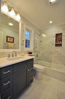
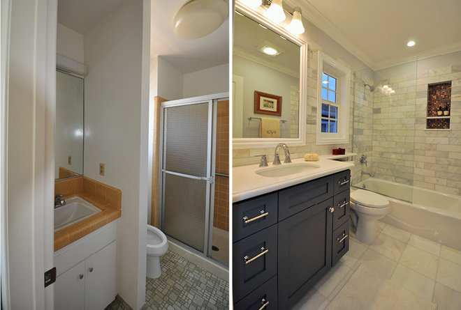
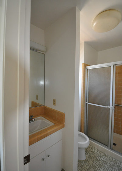
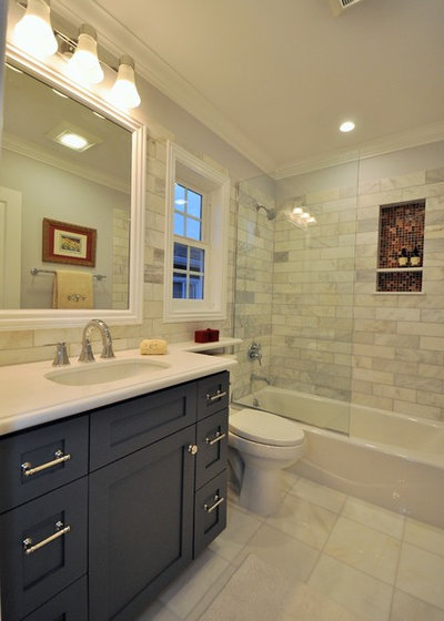
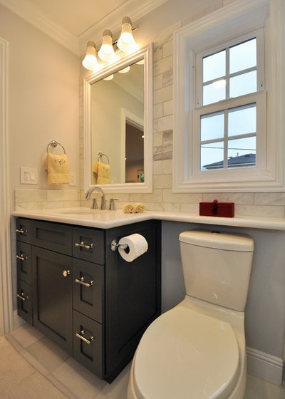
AFTER: Removing the wall opened up the space, while Carrara marble tile on the walls and floor brought the room into the current decade.
Forteza replaced the plumbing, electrical and insulation, things he always recommends for homes built in the 1940s and ’50s. “These homes have seen their time,” he says. “Ninety-five percent of the time when you gut out, you will see dry rot, termite-infested wood — you want to fix that. Putting new tile down won’t fix what’s wrong inside the walls.”
But while newer homes won’t have these kinds of problems, Forteza says you should be wary of past remodel projects too. “You never know what quality a previous homeowner instituted,” he says. In other words, always build a 10 to 20 percent contingency into your budget, no matter what the size of your bathroom.
Wall tile: Carrara marble, 4 by 12 inches, Home Depot; floor tile: Carrara marble, 12 by 12 inches, Home Depot; sink: Stinson undermount in white (442007-U-0), Sterling by Kohler; faucet: Grandera widespread low spout lavatory (20418000), Grohe; bathtub: Villager in white, 32 by 60 inches, Kohler; tub spout: Grandera, 9¼ inches, Grohe; thermostat trim with diverter: Metris C in chrome (15753001), Hansgrohe; hand shower: Movario 5 (28444000), Grohe
Forteza extended the Caesarstone countertop above the toilet, a move he likes to do in compact bathrooms whenever he can. “That 6 or 7 inches of depth gives a lot of counter space,” he says.
Toilet: Dual Force in white (402086-0), Sterling by Kohler; wall color: Cold Wind (DE6351), flat, Dunn-Edwards; vanity: maple, custom; vanity color: Gray (2121-10), Benjamin Moore; countertop: Frost White, Caesarstone
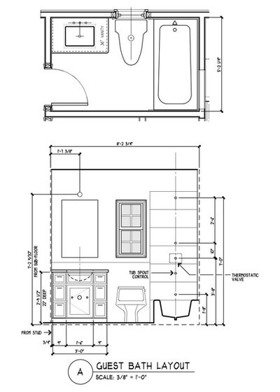
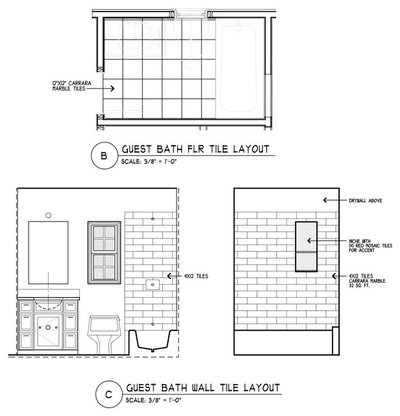
These drawings show the tile layout.
Walls moved: No, but one nonstructural half-wall was removed.
Plumbing moved: Yes. Everything was reconfigured. The shower head switched walls, and the sink plumbing was rerouted from the wall up through the floor.
Plumbing replaced: Yes, and electrical
Professionals hired: Forteza acted as designer and builder.
Special features: Frameless glass without door. “It makes it look nice and clean,” Forteza says.
Splurges: Plumbing fixtures and custom cabinets. “Try to splurge and be happy,” Forteza says. “The difference between a Home Depot cabinet and a custom cabinet is not going to cost your mortgage. You’re going to be looking at it every single day. You might as well save up more and be happy with it.”
Savings: Off-the-shelf tile from a big-box store. “I usually buy tiles from a special tile supplier, but I saw this for a bargain price and bought a bunch,” he says. He also saved on design and building fees by doing the work himself. ♦︎
2. From 1950s to Timeless
Location: Brooklyn, New York
Cost: $20,000
Designer: Julia Mack of Julia Mack Design
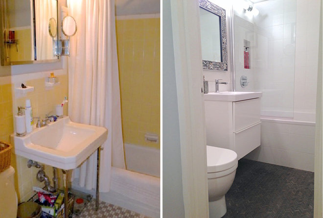
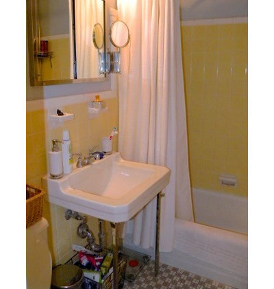
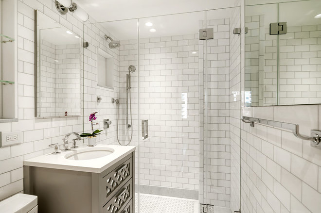
AFTER: Designer Julia Mack began with a mostly white tile palette, which, like the frameless glass shower enclosure, gives the illusion of more space. The simple color scheme, unlike the dicey yellow from before, has built-in staying power. “I prefer to keep tile neutral because it will be there for a long time and you don’t want to get tired of colors,” Mack says. “If you really want color, add it through wall paint that can be easily changed, or towels and accessories.”
The glossy white tile features a subtle horizontal stripe, and Mack thought this would look good paired with small matte black tile installed in a herringbone pattern on the floor. “Once these two items were finalized, I knew that the large pearl inlaid mirror was imperative,” Mack says. “It adds a modern quality plus some needed pattern and interest to the white space.”
Walls moved: No
Plumbing moved: No
Plumbing replaced: Yes
Professionals hired: Donald Meta (contractor), Julia Mack of Julia Mack Design (interior design)
Special features: A new glass shower enclosure that visually expands the space
Splurges: Tiled shower niche with two tiled shelves
Savings: Mack kept the existing lighting and bought an inexpensive sink cabinet from Ikea.
Sink cabinet: Godmorgon/Odensvik, Ikea; wall and floor tile: Porcelanosa; faucet and glass shower enclosure: Porcelanosa; toilet and bathtub: Duravit; mirror: charcoal mother of pearl, ABC Carpet and Home ♦︎
3. From Ceramic Nightmare to Marble Dream
Location: Central Park West, New York City
Cost: About $12,000 (for materials only; not including demolition, labor, paint or design fees, as this was part of a whole-house renovation)
Designer: Sharon Pett of Pett & Associates
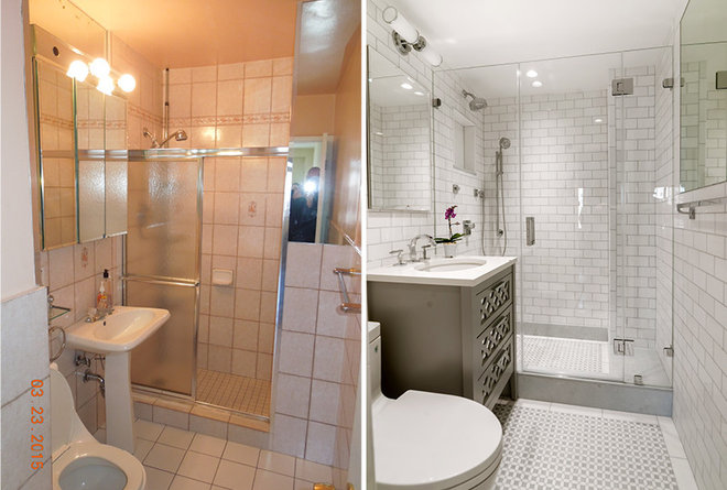
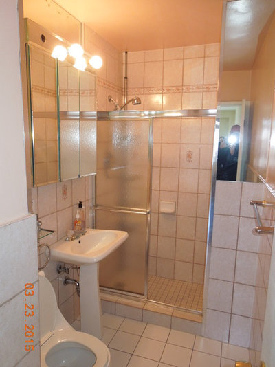
BEFORE: Built in 1959, the bathroom still featured the same ceramic tile with stuck-on soap dishes and an ineffective shower door. A pedestal sink lacked storage, and there were no niches to make up for it.
The owners had been living in this Central Park West condo for 25 years and were tired of the way the bathroom looked.
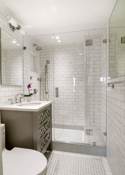
AFTER: The homeowners wanted something “classic yet elegant and somewhat feminine,” Pett says. She gutted the space down to the studs and started fresh. She covered the floor and walls in Thassos marble tile, with hints of blue on the floor and in the grout, a nod to one of the homeowner’s Greek heritage.
Sink: undermount, Kohler; countertop: Caesarstone; faucet, toilet and towel bar: Toto; shower head, arm and body spray: Kohler; vanity: Furniture Guild; medicine cabinet and shower door enclosure: Lexington, GlassCrafters; wall tile: white Thassos marble subway tile; floor tile: Blue Celeste and Thassos marble mosaic; shower base tile: Blue Celeste slabs; niche tile: Blue Celeste and white Thassos marble slabs
To gain storage, Pett added a large vanity with an undermount sink that allowed for several drawers. She also created two wall niches, one above the toilet and another in the shower, each lined with slabs of Blue Celeste and white Thassos marble.
Walls moved: No
Plumbing moved: No
Plumbing replaced: Yes, and electrical
Professionals hired: General contractor
Special features: Floor-to-ceiling marble tile, frameless shower enclosure and recessed niches
Splurges: Everything ♦︎
4. From Junky Storage Closet to High-End En Suite
Location: Tribeca, New York City
Cost: About $60,000 (not including architect fees and permits)
Designer: George Ranalli of George Ranalli Architect
Remodeling a bathroom is one of the most expensive and time-consuming projects you can tackle in your home. But creating a new bathroom where there wasn’t one before? That’s a whole different level of commitment — and budget.
That’s what Julie Press and her husband, Simon Potter, faced in their newly purchased Tribeca loft, which had three bedrooms but only one bathroom. Not an ideal situation when the couple’s son comes home on college breaks. And not ideal for resale value in a high-end market.
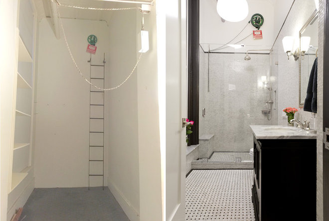
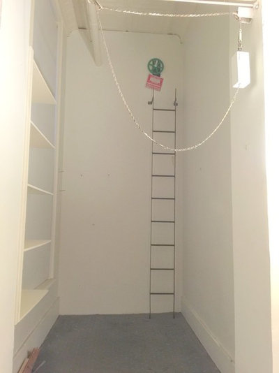
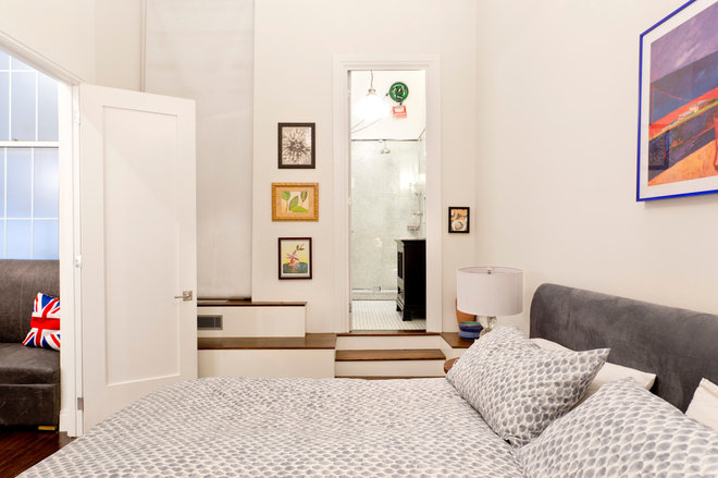
BEFORE: The couple turned their attention to what previous owners had described as a dressing room (shown here) right off the master bedroom. While the previous owners had been using the space for storage, Press saw it as a perfect opportunity to create an en suitebathroom. (To make up for what would’ve been lost closet space, they converted three bedrooms into two and used the remaining space to create a walk-in closet.)
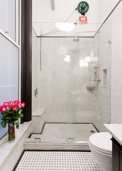
The ladder seen here leads to a green wheel that firefighters can use to turn off the sprinkler system once a fire is under control. Press and Potter’s architect, George Ranalli, originally said that regulations prevented him from touching the mechanism and that the couple would have to shower next to the ladder. After some research, however, Ranalli discovered a regulation chain system that fits over the wheel.
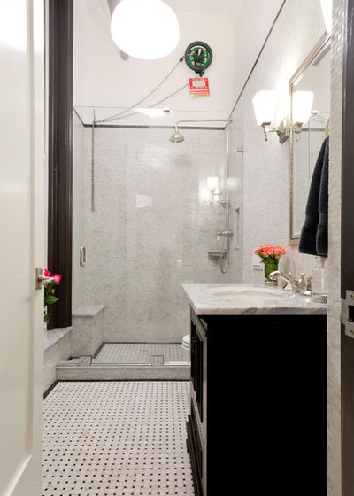
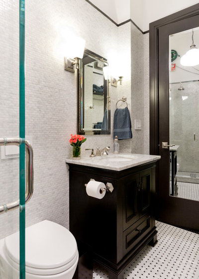
AFTER: Press and Potter spared no expense in the new bathroom. Being in Tribeca, they knew that if they were to sell the loft in the future, the bathroom would have to appeal to high-end clients. “I wanted it to be beautiful,” Press says.
Mosaic Carrara marble tile covers the walls up to 8 feet and is capped with a black marble border tile. Carrara marble in a basket-weave pattern adorns the floor. Press estimates she spent $7,300 on tile and $7,800 on installation.
Here you can see the required sprinkler wheel with the chain system.
Floor tile: Bianco Carrara marble with Nero Marquina dots in basket-weave mosaic; wall tile: Carrara marble, polished white, mosaic offset brick pattern; border tile: polished black velvet marble, square mosaic, ⅝ inch
A wall-mounted toilet and recessed medicine cabinet make the most of the tight quarters, while mirrors help create more visual space.
Toilet: Aquia wall-hung with in-wall tank in Cotton, Toto; faucet, toilet paper holder and towel ring: Le Verre and La Crosse, Phylrich; vanity: Ronbow Venice, 30 and 9/16 inches; countertop: Carrara marble; sconces: Sophie 1 in polished nickel (WB1724PN), Murray Feiss; medicine cabinet:framed lit right-opening inset, large, Restoration Hardware
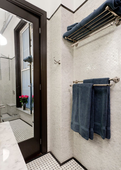
Polished nickel wall hooks, towel bar and towel rack provide storage options.
Double towel bar: Nicole, 24 inches, Alno; towel rack: Nicole, 24 inches, Alno; robe hook: Nicole, Alno
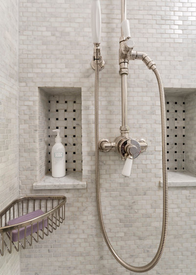
Carrara marble tile in a basket-weave pattern lines two shower niches, connecting the shower to the floor tile.
Shower head: Highgate exposed thermostatic system with 6-inch shower rose and white porcelain lever handles, Waterworks
Looking from the bedroom into the bathroom, this photo shows how the bathroom had to be raised to accommodate new plumbing.
Walls moved: No, but the floor had to be raised to accommodate new plumbing.
Plumbing moved: Yes, from one side of the home to another
Plumbing replaced: Yes. There wasn’t any plumbing here before, so everything is new.
Professionals hired: George Ranalli Architect; Guy Gorodishtan, Kitchen Bathroom Plus (contractor)
Special features: Floor-to-ceiling marble; recessed niches and medicine cabinet
Splurges: Everything
Savings: This was a whole-home remodel, and Press and Potter saved elsewhere in the project in order to go all out in the bathroom. ♦︎
5. From ‘Dark and Dreary’ to Light and Cheery
Location: Livermore, California
Cost: $11,238
Designer: Homeowner Joanne Payling designed the space, chose the materials and worked with the contractor.
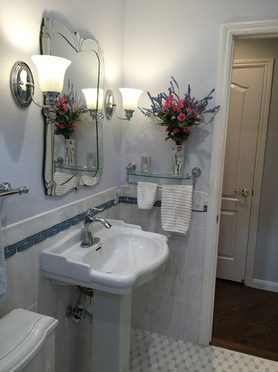
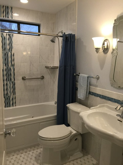
AFTER: Payling and her husband, Larry Stanker, hired a contractor, Gene George, to gut the space down to the studs. Payling then set out choosing materials and fixtures for George to install.
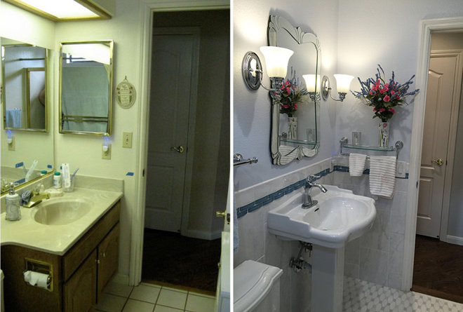
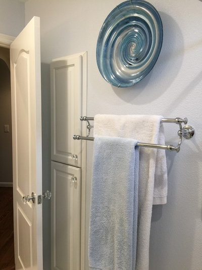
Payling looked for a vanity with an undermount sink and lots of storage, but she couldn’t find one she liked in her price range. She saw a pedestal sink she really liked, but it didn’t offer any storage. Then she came across a photo on Houzz of recessed storage set between wall studs. She had her contractor build a cabinet into the wall studs behind the door, and that solved her storage dilemma.
Payling says that not having a designer helped her cut down on cost, but it also opened the door for a few mistakes to slip through. For example, she wished she had been present when the wall tile went up. She would’ve had the light switches installed higher so the tile wouldn’t have to be cut and worked around them. “But this was a DIY project, and I’m not a designer, so I don’t freak out about that stuff too much,” she says.
Mirror: Messina, Howard Elliott; sink: English turn pedestal, Home Depot; sconces:Eurofase Fountaine Collection, Home Depot; faucet: Santiago, Pfister
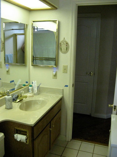
BEFORE: The original vanity and recessed medicine cabinet didn’t offer much storage, and when the couple’s college-age daughter was in town, everything ended up on the counter.
The couple also wanted to do away with the plastic shower-tub insert and the gold-colored accents.
AFTER: Payling splurged on the white Thassos marble tile with Blue Celeste dots for the floor; she saved by going with inexpensive ceramic tile for the shower and walls, both of which she spiffed up with glass and marble tile accents.
Payling also would’ve liked the toilet tank to touch the wall behind it rather than have a gap of a couple of inches — another design detail she feels could have been prevented if she had hired a designer or been present at installation.
Floor tile: Octave white Thassos with Blue Celeste dots; bathtub accent: Waterscape glass and marble, Allure; wainscot glass tile: Loft Crescent Cool Springs; wall and shower tile: ceramic, Lowe’s; bathtub: Devonshire jetted, Kohler; toilet: Devonshire comfort height two-piece elongated, Kohler
Here you can see the recessed cabinet storage behind the bathroom door. The cabinets hold cleaning supplies, extra toothpaste and soap, and can even hold toilet paper rolls, as long as they’re not the big fluffy kind. A linen closet across the hall also adds storage.
“I’m thrilled with how it turned out,” Payling says. “It went from dark and dingy to light and bright.”
Walls moved: No
Plumbing moved: No
Plumbing replaced: No
Professionals hired: Gene George (contractor)
Special features: Recessed wall cabinets; marble floor tile, glass and marble accent tile
Splurges: Marble floor tile
Savings: Basic off-the-shelf wall and shower tile. Payling also saved by acting as her own designer. ♦︎
More: How Much Does a Bathroom Remodel Cost?
See more bathroom makeovers
Shop Houzz: An Industrial Dining Room for Every Budget
Shop Houzz: An All-White Living Room
Houzz Tour: Comic Book Prints and Vintage Decor Punch Up a Dublin Home
My Houzz: Leafy, Light-Filled Loft in a Historic Former High School
My Houzz: Music and Eclectic Finds Rock a Family’s Los Angeles Hideaway
My Houzz: Laid-Back Style in a San Francisco Home
My Houzz: Cool Monochrome Vibes and DIY Touches in a Rental
Houzz Tour: Designer Makes His Place Chic on a Dime























hwswthr
I like that you showed #1 & #5. Each took an opposite approach to toilet space and made it look better. Each home has different needs and each designer has a different eye. And in #4, I appreciate how the designer dealt with the pipes and a required fire wheel in the shower stall. It isn’t as aesthetically appealing but makes for a good story. More interesting than a bathroom in a newly built suburban hone.
mrsben
All are fantastic upgrades! Though not a designer having completed one bathroom upgrade and have three more to go so here are a few of IMHO tips: a) If you can, avoid moving the toilet as otherwise it will be costly. Also consider its ‘rough in’ (distance from the wall to the drain pipe) prior to purchasing one. Note: The width of most toilet tanks today are not as deep either so you may end up with a gap between it and the wall as in pic #5. Also be aware of elongated bowls as they may not fit into your space. b) Make a floor plan and measure not once but twice for fixed elements. i.e.: Vanity, tub, toilet, niches etc. c) To give an illusion of space, do not hesitate to use larger tiles or mirrors. Also, even the colour of grout you choose for tile can influence the illusion. d) If vanity countertop space is limited, consider adding a wall niche beside it. The same element can be applied for tub/shower stall areas. For size and/or spacing of shelves, it will depend upon your personal needs. e) Also, in lieu of double faucets, consider a single one instead as maintenance is a snap plus you will have extra room for that hairbrush … ☺. Manufactures have come a long way in styling. f) Install shelving where you can. i.e.: The areas behind a toilet tank; over or on a door is often wasted space. g) Recycle what you can. i.e.: If not changing the location of your vanity and particularly if it was custom built to fit the space, consider salvaging its frame and equip it with new doors/drawer fronts/hardware etc. All said; as cost is a factor I highly suggest you shop around and price compare. For myself; one flooring tile was half the price in a big box store compared to that in a high-end showroom. (Yes, they were identical!) Also, as I live in Canada I ordered a lot online from the United States. i.e.: Plumbing to lighting fixtures to hardware (using a guideline if something might have to be returned ) and could elaborate more, but basically they were at least half the price. In summary; when designing consider your needs and when budgeting choose your priorities.
P.S: I apologize for my long comment.
phoebe3
I just love number 5. The between-studs storage allowed for a very classy looking sink and helped make the most of the space.