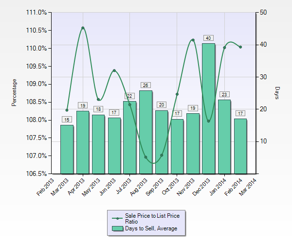
Not surprising the housing market in the Bay Area can be overwhelming if you are a buyer. The chart above reflects the average days on the market for a single family home in the past calendar year. Even though these are averages, with the majority of sales completed short of a month, if you aren’t on top of the market and know what you are competing with you might have to make 3 or 4 offers on homes before you are successful. For instance, are you competing with cash buyers or buyers that have a large down payment. Are your competitors closing quickly or are they offering incentives to the seller? It doesn’t take but a few losses to figure out what it will take to be successful.
Also of note, the Sale Price to List Price ratio reflects that the average home price sold during the last year was at least 6.5% above the listed price. Coincidentally March of 2013 and March 2014 are almost exactly the same at 10.5% and 10% overages respectfully. What I did find encouraging is that the average overages, 10%, weren’t astronomical. That amount is still within a conservative margin for lenders to value appreciation especially when the media is reporting housing price sales are up 35% from last year.
Just a note of caution. The past correction in the Housing Market started with a drop in the stock market yielding loss of income by market investors. Constricted home budgets then caused mortgage delinquencies which resulted in many foreclosures. In effect glutting the housing market with more supply than demand. When this happens home prices fall. Does history repeat itself? For now we have low inventory, a bevy of buyers and the result is an increase in home sale prices. Great for Sellers, it’s a Sellers’ Market….but remember in a blink of an eye….the tables can turn and then it’s a Buyers’ Market.